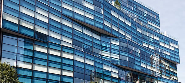
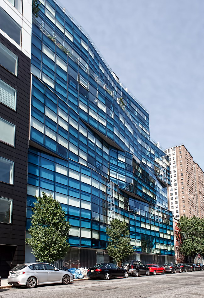
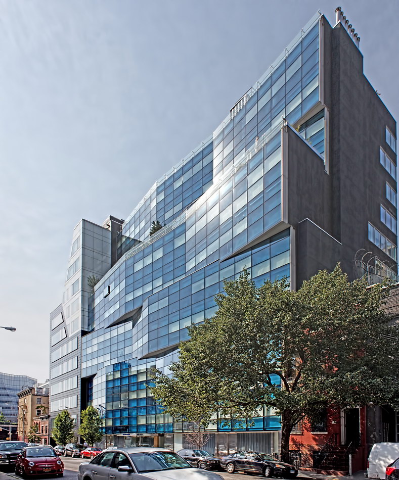
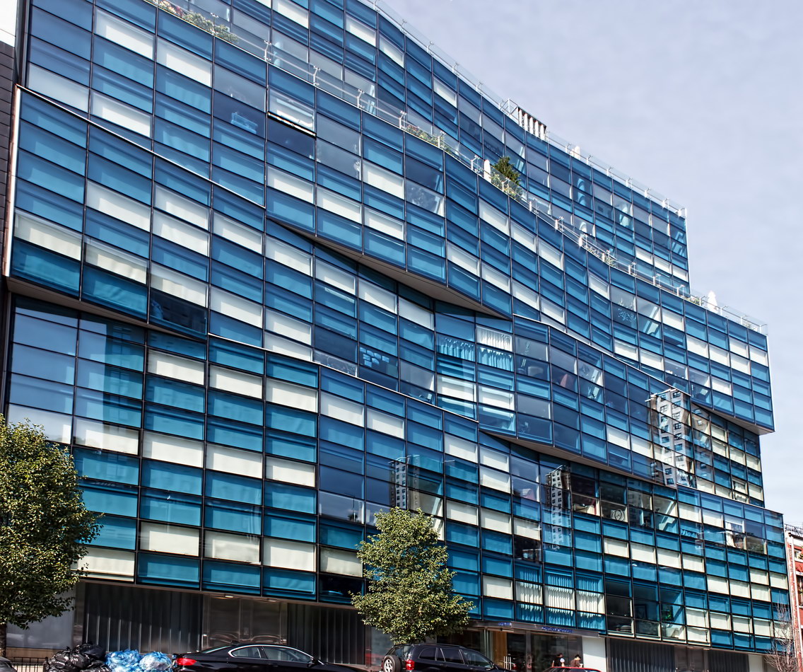
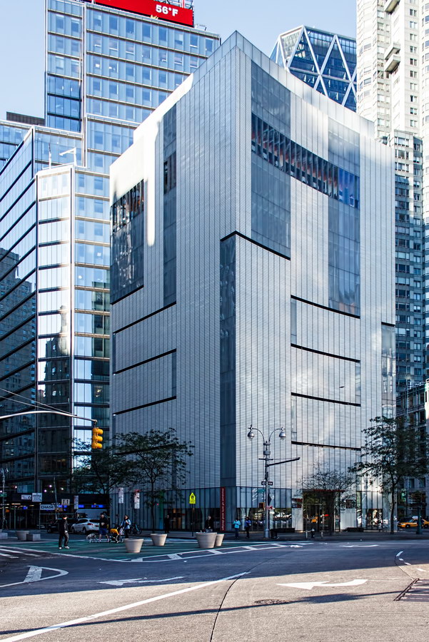
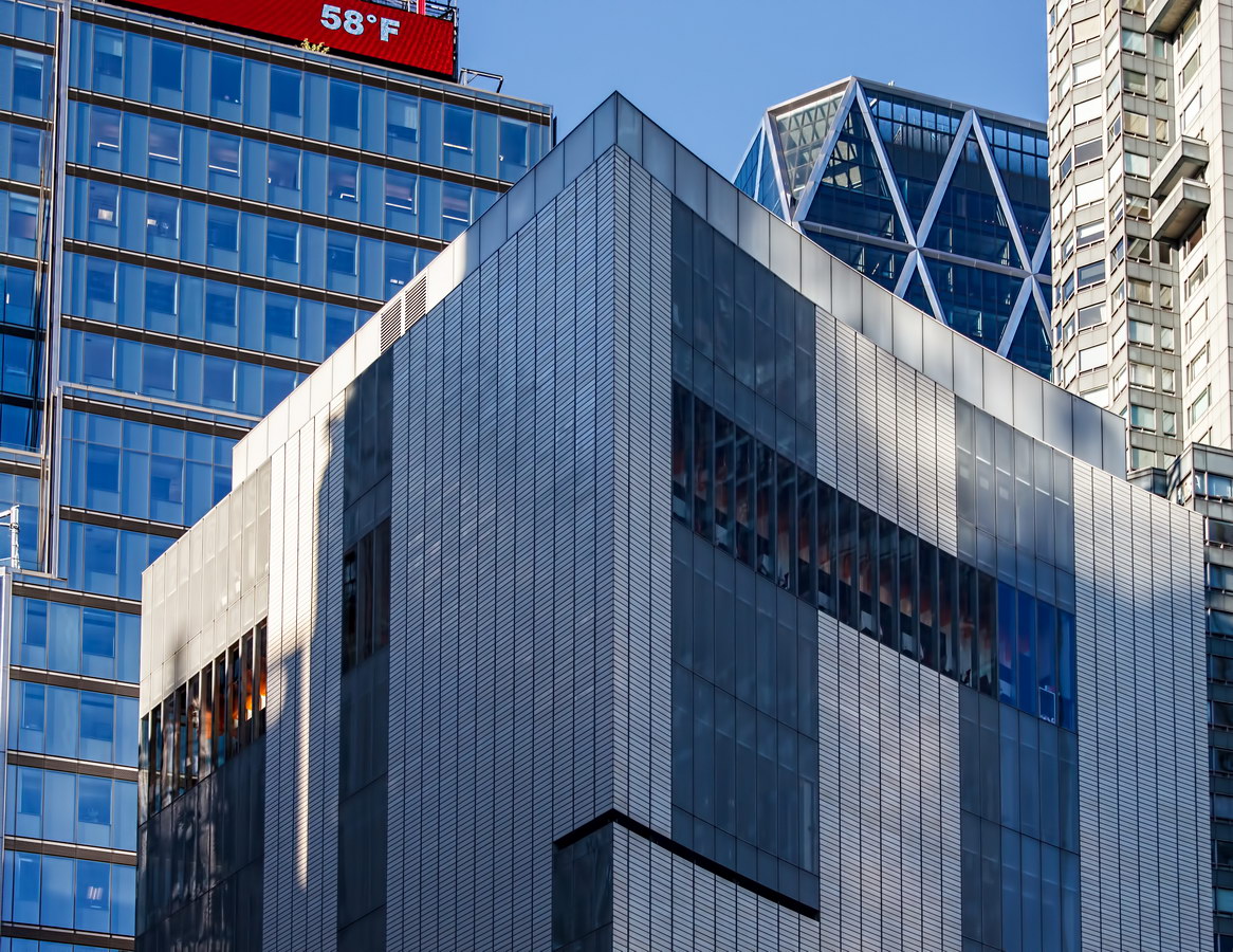
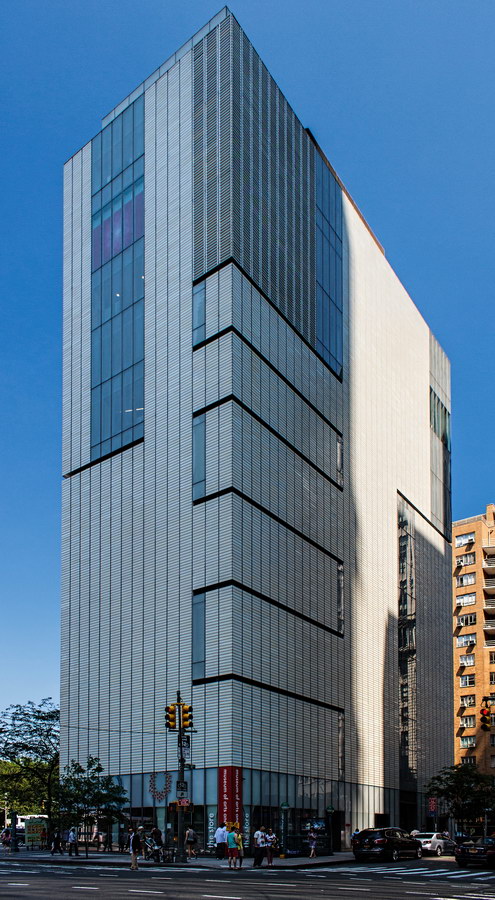
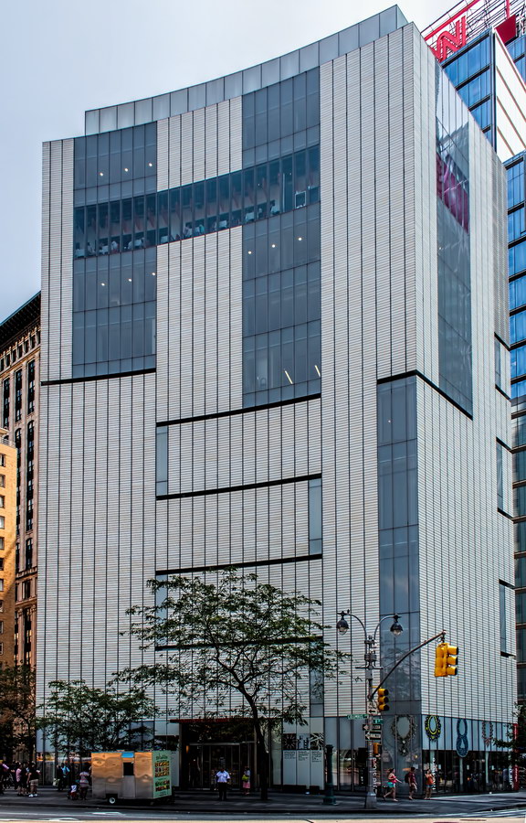
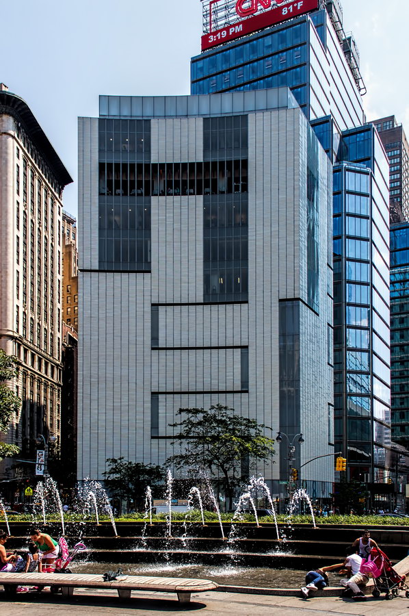
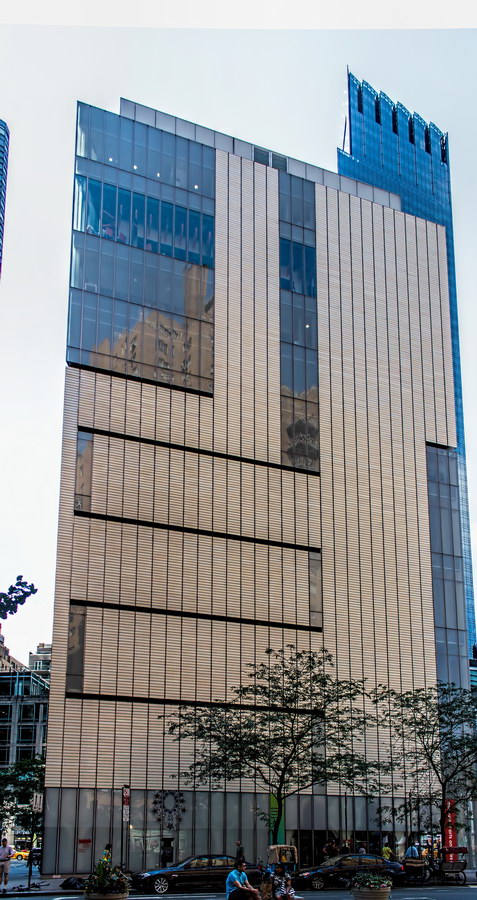
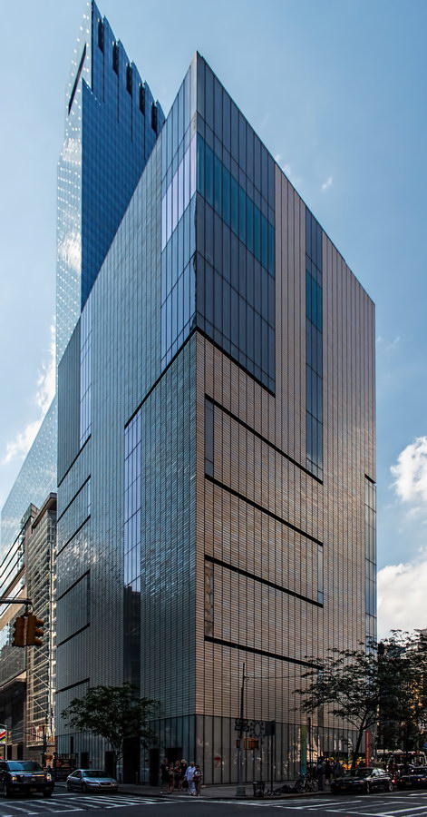
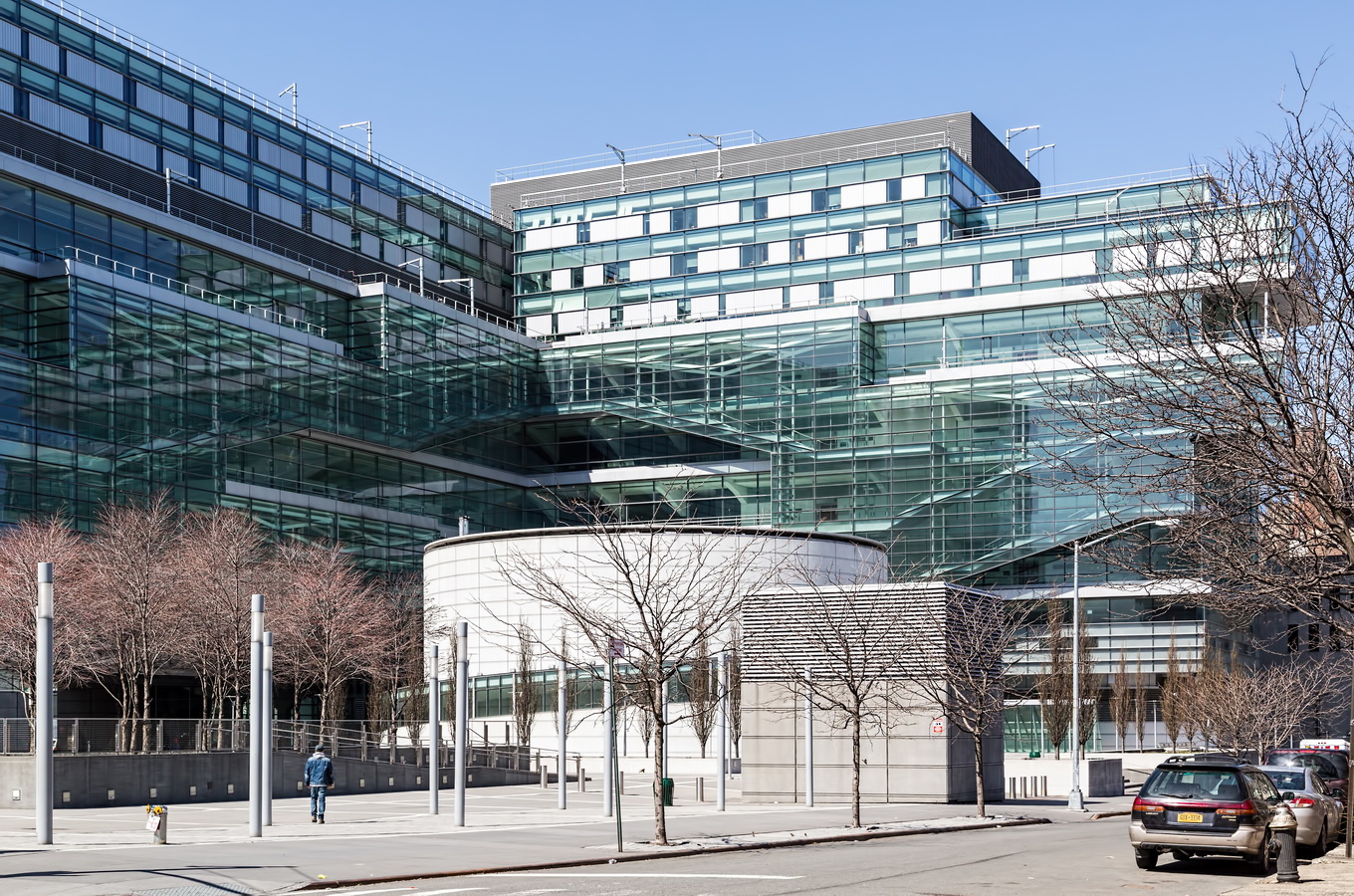
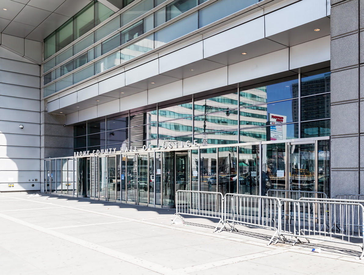
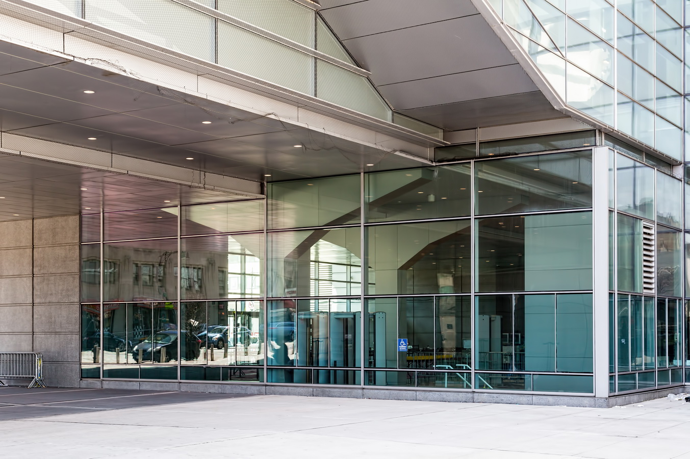
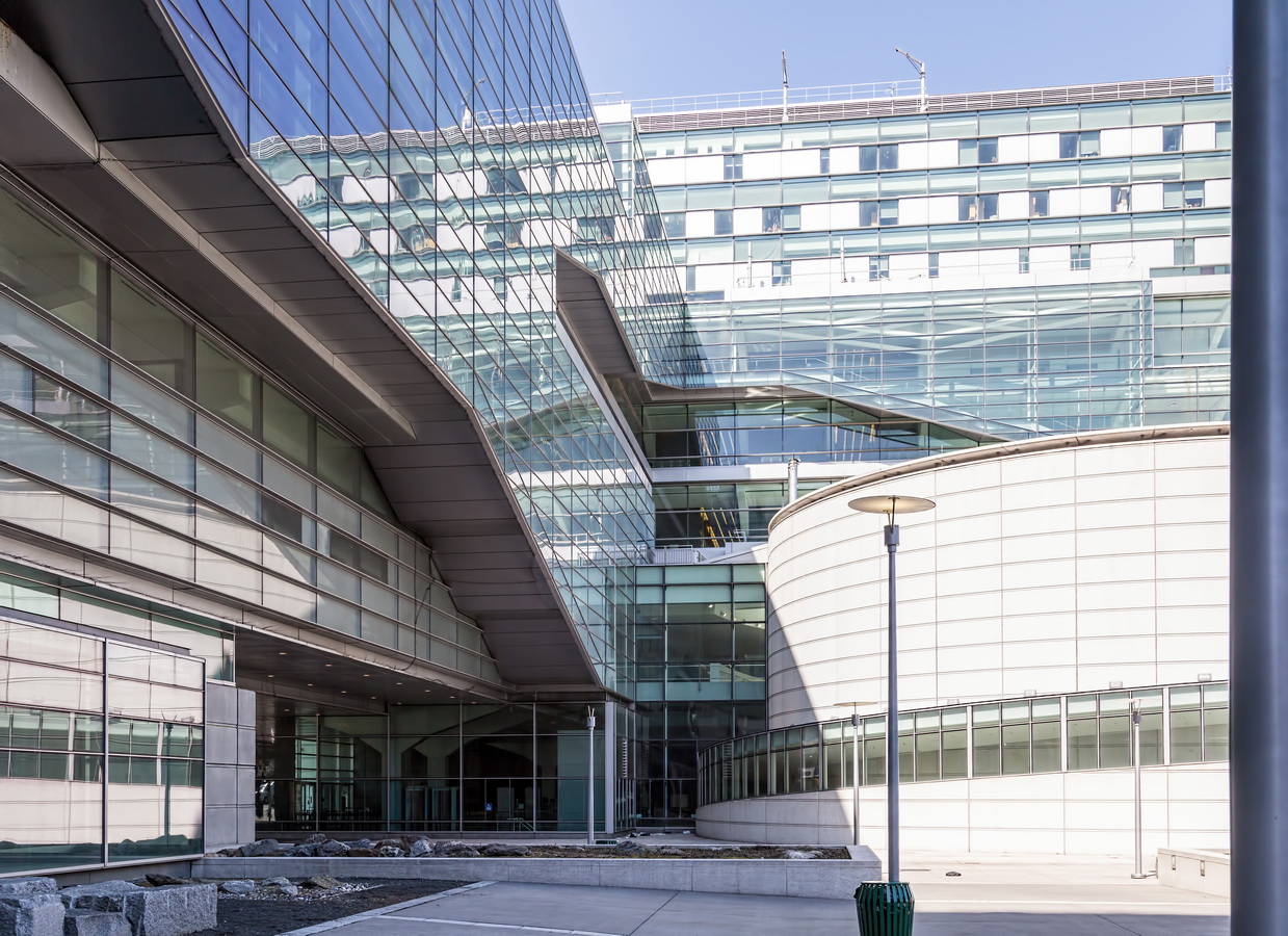
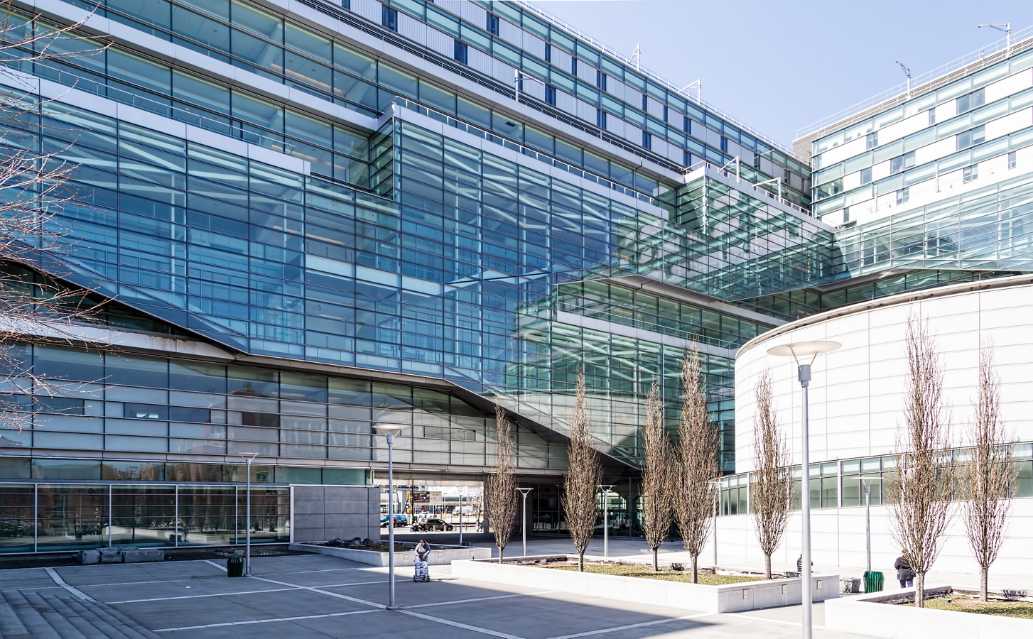
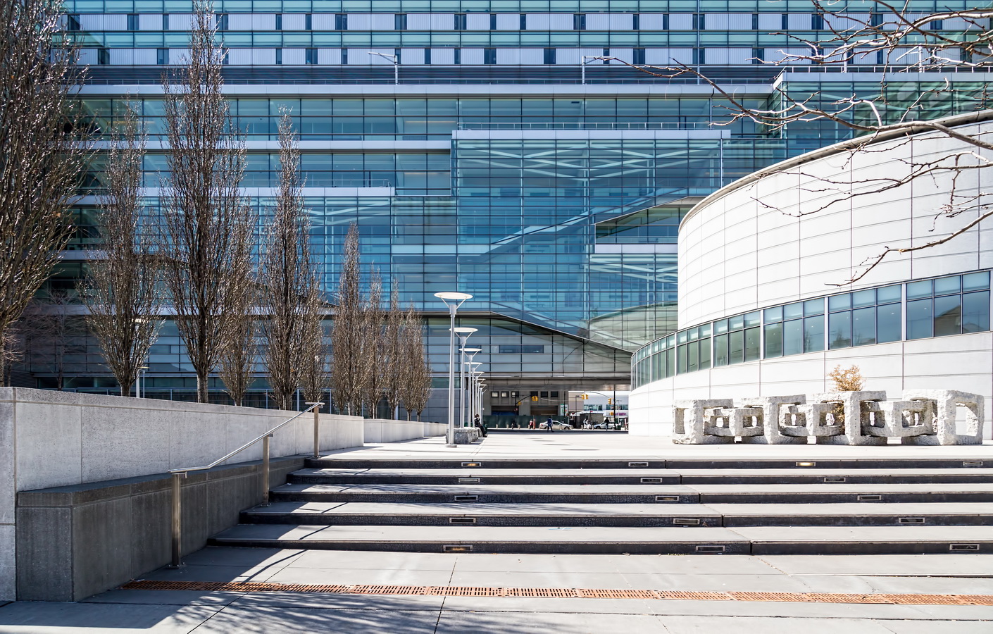
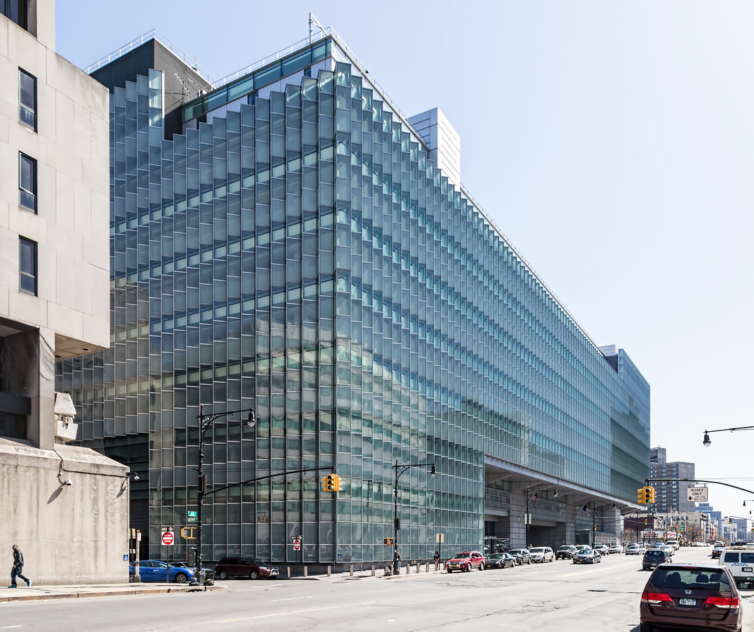
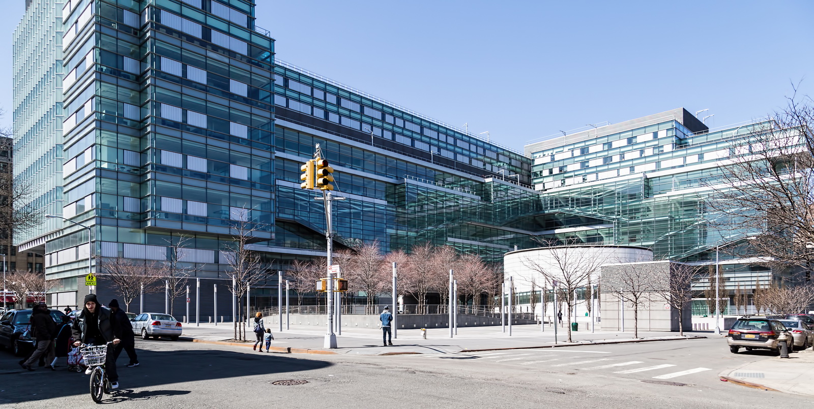
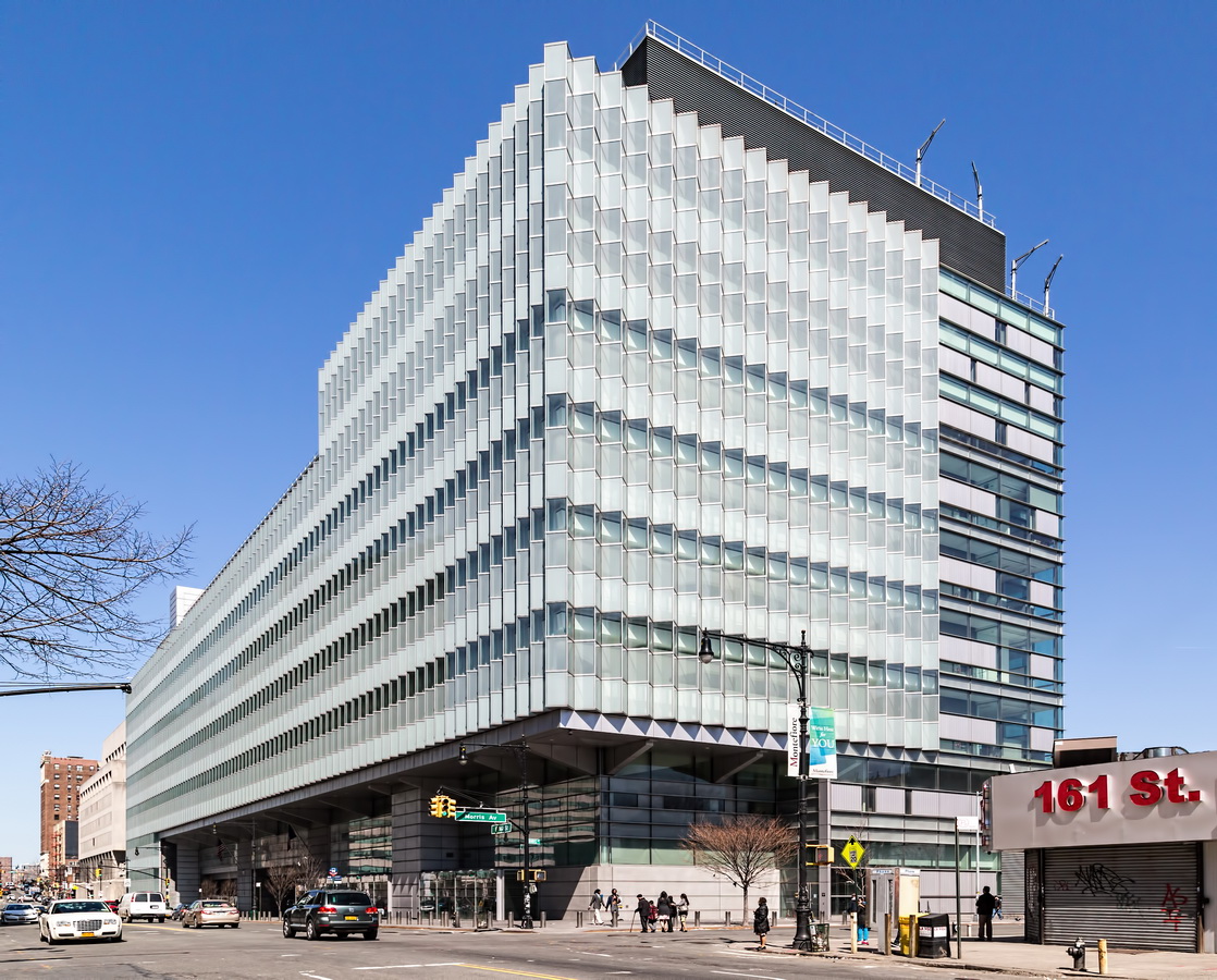
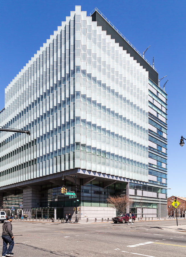
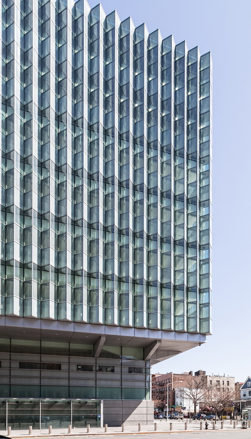
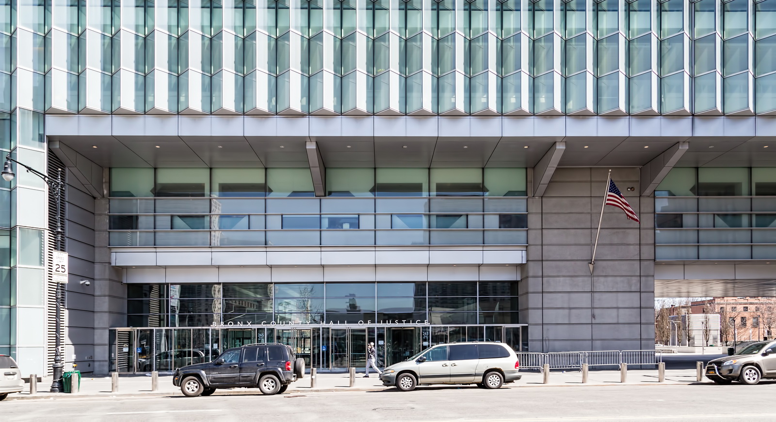
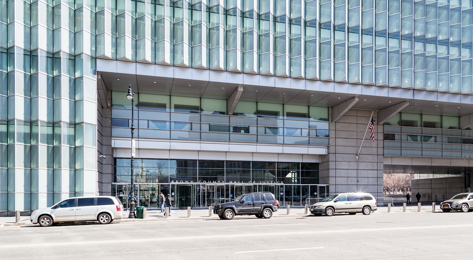
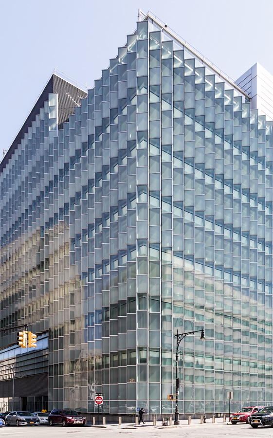
Bronx County Hall of Justice reverses centuries of tradition: The aluminum and glass facades are designed for openness and transparency instead of monumental intimidation.
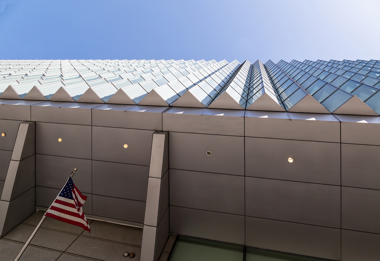
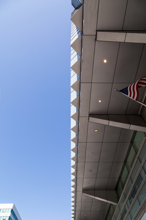
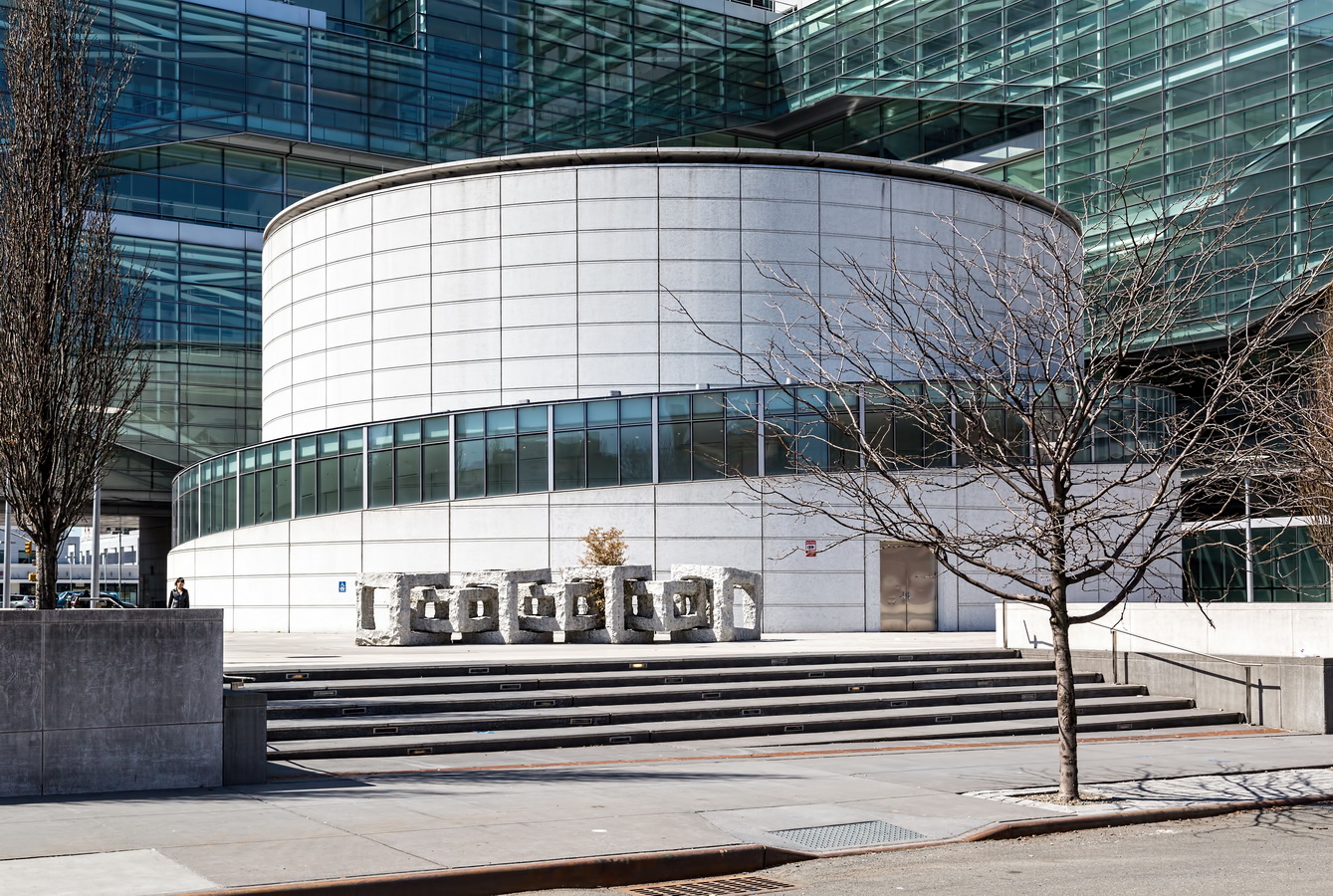
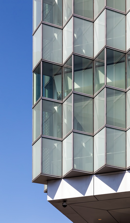
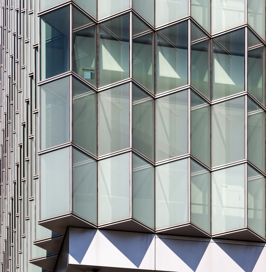
According to the architects, “The image of the courthouse in society was of primary concern in the design of the building. The program is organized in a linear manner around an open civic space and layered from public to private, with the public circulation, animated by a series of cantilevered stairs, facing the open space. Within the courtyard sets a free-standing public building that serves as the jury assembly room, gives scale to the space, and is the symbolic as well as formal focus of the project. The exterior wall design responds to the various functions within and orientations of the building. The curtain wall facing the south and west takes the shape of a folded plane with integrated light shelves that reflect light into the courtrooms and shade the adjacent corridor. The intent is to express the building as open and inviting, a metaphor for the transparency of the judicial process.”
The building is a dazzling contrast to the Bronx Criminal Court, next door, and the Bronx County Building (originally Bronx County Courthouse) at Grand Concourse, just two blocks west.
Despite its openness, the Hall of Justice was built with security in mind: The glass walls are bullet- and blast-resistant.
While the building’s design was exceptional, the construction was anything but. The construction site was contaminated, the low-bidding contractor was disqualified for suspected mob ties, the underground garage was deemed unsafe, and air conditioning for the court computers didn’t work. The four-year, $325 million project stretched accordion-like to six years and $421 million, opening in 2008.
Bronx County Hall of Justice Vital Statistics
- Location: 265 East 161st Street between Sherman and Morris Avenues
- Year completed: 2008
- Architect: Rafael Viñoly Architects
- Floors: 10
- Style: Postmodern
Bronx County Hall of Justice Recommended Reading
- Wikipedia entry
- The New York Times Opening a Courthouse, Overdue and Over Budget (April 22, 2007)
- The New York Times Bronx Courthouse to Open, Costlier and Later Than Planned (January 25, 2008)
- NYC Citywide Administrative Services listing
- Rafael Viñoly Architects’ project page
- New York Construction feature story
- Emporis database
![C_IMG_7735_6_7Adjust [4/5/2012 7:31:27 AM] C_IMG_7735_6_7Adjust [4/5/2012 7:31:27 AM]](https://www.newyorkitecture.com/wp-content/gallery/three-sisters-downtown-brooklyn/c_img_7735_6_7adjust.jpg)
![IMG_8137_8_9Adjust [4/5/2012 10:27:32 AM] IMG_8137_8_9Adjust [4/5/2012 10:27:32 AM]](https://www.newyorkitecture.com/wp-content/gallery/three-sisters-downtown-brooklyn/img_8137_8_9adjust.jpg)
![IMG_7888_89_90Adjust [4/5/2012 8:47:47 AM] IMG_7888_89_90Adjust [4/5/2012 8:47:47 AM]](https://www.newyorkitecture.com/wp-content/gallery/three-sisters-downtown-brooklyn/img_7888_89_90adjust.jpg)
![IMG_7693_4_5Adjust [4/5/2012 7:25:17 AM] IMG_7693_4_5Adjust [4/5/2012 7:25:17 AM]](https://www.newyorkitecture.com/wp-content/gallery/three-sisters-downtown-brooklyn/img_7693_4_5adjust.jpg)
![IMG_7642_3_4Adjust [4/5/2012 7:11:07 AM] IMG_7642_3_4Adjust [4/5/2012 7:11:07 AM]](https://www.newyorkitecture.com/wp-content/gallery/three-sisters-downtown-brooklyn/img_7642_3_4adjust.jpg)
![D_IMG_7654_5_6Adjust [4/5/2012 7:13:21 AM] D_IMG_7654_5_6Adjust [4/5/2012 7:13:21 AM]](https://www.newyorkitecture.com/wp-content/gallery/three-sisters-downtown-brooklyn/d_img_7654_5_6adjust.jpg)
![D_IMG_6937_8_9Adjust [4/4/2012 9:12:45 AM] D_IMG_6937_8_9Adjust [4/4/2012 9:12:45 AM]](https://www.newyorkitecture.com/wp-content/gallery/three-sisters-downtown-brooklyn/d_img_6937_8_9adjust.jpg)
![C_IMG_7777_8_9Adjust [4/5/2012 7:46:51 AM] C_IMG_7777_8_9Adjust [4/5/2012 7:46:51 AM]](https://www.newyorkitecture.com/wp-content/gallery/three-sisters-downtown-brooklyn/c_img_7777_8_9adjust.jpg)
![C_IMG_7744_5_6Adjust [4/5/2012 7:35:41 AM] C_IMG_7744_5_6Adjust [4/5/2012 7:35:41 AM]](https://www.newyorkitecture.com/wp-content/gallery/three-sisters-downtown-brooklyn/c_img_7744_5_6adjust.jpg)
![C_IMG_7741_2_3Adjust [4/5/2012 7:34:28 AM] C_IMG_7741_2_3Adjust [4/5/2012 7:34:28 AM]](https://www.newyorkitecture.com/wp-content/gallery/three-sisters-downtown-brooklyn/c_img_7741_2_3adjust.jpg)
![A_IMG_7750_1_2Adjust [4/5/2012 7:40:41 AM] A_IMG_7750_1_2Adjust [4/5/2012 7:40:41 AM]](https://www.newyorkitecture.com/wp-content/gallery/three-sisters-downtown-brooklyn/a_img_7750_1_2adjust.jpg)
![C_IMG_6880_1_2Adjust [4/4/2012 9:04:57 AM] C_IMG_6880_1_2Adjust [4/4/2012 9:04:57 AM]](https://www.newyorkitecture.com/wp-content/gallery/three-sisters-downtown-brooklyn/c_img_6880_1_2adjust.jpg)
![B_IMG_8362_3_4Adjust [4/6/2012 9:27:57 AM] B_IMG_8362_3_4Adjust [4/6/2012 9:27:57 AM]](https://www.newyorkitecture.com/wp-content/gallery/three-sisters-downtown-brooklyn/b_img_8362_3_4adjust.jpg)
![B_IMG_8359_60_61Adjust [4/6/2012 9:27:24 AM] B_IMG_8359_60_61Adjust [4/6/2012 9:27:24 AM]](https://www.newyorkitecture.com/wp-content/gallery/three-sisters-downtown-brooklyn/b_img_8359_60_61adjust.jpg)
![B_IMG_7669_70_71Adjust [4/5/2012 7:17:29 AM] B_IMG_7669_70_71Adjust [4/5/2012 7:17:29 AM]](https://www.newyorkitecture.com/wp-content/gallery/three-sisters-downtown-brooklyn/b_img_7669_70_71adjust.jpg)
![B_IMG_7411_2_3Adjust [4/4/2012 12:04:00 PM] B_IMG_7411_2_3Adjust [4/4/2012 12:04:00 PM]](https://www.newyorkitecture.com/wp-content/gallery/three-sisters-downtown-brooklyn/b_img_7411_2_3adjust.jpg)
![B_IMG_6961_2_3Adjust [4/4/2012 9:19:19 AM] B_IMG_6961_2_3Adjust [4/4/2012 9:19:19 AM]](https://www.newyorkitecture.com/wp-content/gallery/three-sisters-downtown-brooklyn/b_img_6961_2_3adjust.jpg)
![B_IMG_6868_69_70Adjust [4/4/2012 9:02:21 AM] B_IMG_6868_69_70Adjust [4/4/2012 9:02:21 AM]](https://www.newyorkitecture.com/wp-content/gallery/three-sisters-downtown-brooklyn/b_img_6868_69_70adjust.jpg)
![AA_IMG_6820_1_2Adjust [4/4/2012 8:49:05 AM] AA_IMG_6820_1_2Adjust [4/4/2012 8:49:05 AM]](https://www.newyorkitecture.com/wp-content/gallery/three-sisters-downtown-brooklyn/aa_img_6820_1_2adjust.jpg)
![A_IMG_7765_6_7Adjust [4/5/2012 7:44:42 AM] A_IMG_7765_6_7Adjust [4/5/2012 7:44:42 AM]](https://www.newyorkitecture.com/wp-content/gallery/three-sisters-downtown-brooklyn/a_img_7765_6_7adjust.jpg)
![C_IMG_6880_1_2Adjust [4/4/2012 9:04:57 AM]](https://www.newyorkitecture.com/wp-content/flagallery/three-sisters/thumbs/thumbs_c_img_6880_1_2adjust.jpg)
![D_IMG_6937_8_9Adjust [4/4/2012 9:12:45 AM]](https://www.newyorkitecture.com/wp-content/flagallery/three-sisters/thumbs/thumbs_d_img_6937_8_9adjust.jpg)
![B_IMG_6868_69_70Adjust [4/4/2012 9:02:21 AM]](https://www.newyorkitecture.com/wp-content/flagallery/three-sisters/thumbs/thumbs_b_img_6868_69_70adjust.jpg)
